Wednesday, May 3, 2023

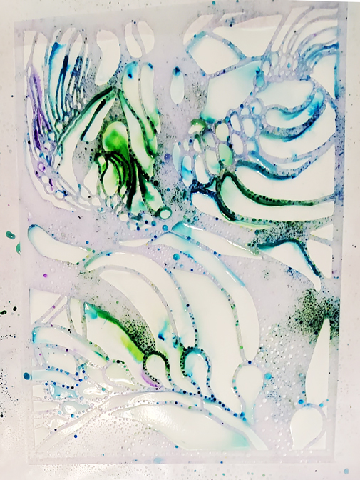
"Melting" Crayons

The newly released, kelp-inspired mask featured today is 6" x 6" Bulbs and Banners s955, which looks like this when it arrives in its white envelope -- 


But today's project began with sturdy beige cardstock that I'd previously printed with an 8-inch round Gelli Plate using my 6" x 6" Penguin Family s393 and purple acrylic paint....


Because the cardstock was the sturdy variety, I felt safe to move forward with an art experiment that would involve water!


Above: Tabs of blue masking tape held my 6" x 6" Bulbs and Banners s955 in place while I used water-soluble crayons to fill in open areas of this kelp-inspired design. (There's a wide variety of water-soluble crayons and each type has its own characteristics. My collection includes several types. I suggest experimenting with each type to find your favorites. What I've used here are Neocolor II.)

Below: Water-soluble crayon now fills every empty area of the design.


Above:  I've used a mister bottle (top center) to spray all the crayon with water -- carefully keeping the water to a minimum, since too much water floats the whole idea away! (Ask me how I know!)

There is of course no real "melting" taking place. But when water-soluble crayon meets water, the effect appears to resemble melting.  The colors ooze together and merge, as if they were areas of colored wax exposed to heat.

Below:  Taking a side-step in this adventure, I made a "sandwich" by placing printer paper atop the wet crayon and, beneath it, the mask and the original print of a penguin family.  I rolled a rubber brayer across the top paper to press it into the wet surface below.


When I lifted off the printer paper, I had a monoprint to the left of my main project; see below....


Left side:  A close-up of this monoprint is posted at the end of today's post.


Above:  I lifted off the kelp-inspired mask, Bulbs and Banners s955 , to let the wet crayon mixture continue drying.

I like what resulted on that sturdy cardstock I'd previously printed using Penguin Family s393.   The effect of the "melting" water-soluble crayons was to enrich, deepen and saturate the original image.

Below is a close-up of that monoprint on printer paper:


Thanks for checking out my blog today! To scroll thru the pages of my stencils and masks at StencilGirlProducts.com, please start here.  The topmost masks on the first webpage are my three new designs:  

9" x 12" Kelp Forest L963...

6" x 6" Bulbs and Banners s955 ...

and 4" x 4" Seabed Greens M339


Tuesday, May 2, 2023

From Black Lava to Gold Flake

For today's post, I've experimented -- with no expectations! -- starting with a sheet of watercolor paper partially coated with black acrylic paint that has dried.

Across the horizontal white space, starting on the left, I placed 6" x 6" Bulbs and Banners s955 (cut from its original square frame and stained green from an earlier project) and followed that with two pieces cut from 9" x 12" Kelp Forest L963 (likewise paint-stained from earlier projects.)  


Above:  Having opened a jar of Liquitex Black Lava acrylic medium (upper left), I've dug into it with a plastic artist's spatula (lower right.)  Below: Holding firmly onto each piece, I've begun to spread the medium through the openings.


Above:  I've lifted off all three of the scissors-altered masks.  Now most of the paper's surface appears near-black, but it will become darker as the lava medium dries, since the lava medium has a white gel vehicle that will turn from white to clear as the medium dries.

Below:  The gel medium has dried.


Next, as shown below, I've used an old brush and palette paper (on the left) to mix Golden Acrylics Manganese Blue liquid paint with Liquitex liquid gloss medium.  With the brush I've begun to spread this mixture across the painting.


After the diluted blue paint has been spread across the paper -- but before it had dried -- I returned with a damp terrycloth rag to wipe back some of the paint, leaving random leave white areas, shown below.


Then I set the piece aside to let the blue layer dry overnight; it needed to be bone-dry before I could use crayons.

Below:  After black lava acrylic gel medium has dried, its gift to us is a gritty surface that welcomes crayon scribbles ....


Above:  This close-up detail shows the two water-soluble crayons that I used.  But any crayons would work.

Below:  I followed the crayon scribbles with Golden Paint's gold mica flakes (small) gel medium, spreading it with the artist's spatula (upper right.)


A close-up detail --


Above:  Like black lava gel medium, gold mica flake gel medium has a vehicle that's white upon application.  Even in this thinly spread layer of gel, the whitish gel is apparent as a faintly cloudy background that dulls the gold.  But the gold will sparkle when the gel has dried into a clear, invisible layer.


A view of the finished piece is below. It's slightly cropped to better show the glitter.


Since today's featured masks are shown in their scissor-customized forms, I'll show the originals below --


6" x 6" Bulbs and Banners s955


9" x 12" Kelp Forest L963

Thank you for stopping to check out my blog today! Daily posts will continue for some little while to show more suggestions for using my new three masks based on formations of Giant Bulb Kelp.  To scroll thru the pages of my stencils and masks at StencilGirlProducts.com, please start here.


Monday, May 1, 2023

Black, White and Friends


Today, I continue experimenting with black and white ... but I also branch out to near-black and near-white ... beige ... and even a bold yellow.

First up:  I started with India ink and near-white printmaking paper.  I used water to dilute the ink so it would spread randomly across the paper.  After the paper had dried, I returned with a bamboo markmaking tool to add a solid black squiggle. My final step had been to make a print with black acrylic paint using Bulbs and Banners s955.

(My go-to method of print-making is to use a sponge brayer loaded with heavy-body acrylic paint. Somewhat similar results can happen with Gelli Plate prints.  In the near future, one of my daily posts will go step-by-step thru an explanation of my favorite way of making prints with stencils and masks.) 


I liked the results, above, but my experimenting had only begun.

Next, I dug out some off-white watercolor papers that I'd spattered and splashed with inks and acrylic paints.  I cut the papers into irregular shapes and glued them to a solid black background, framing a print made using 6" x 6" Bulbs and Banners s955.


Above:  I like the print at the top of today's post but I feel more satisfied with this collage.

Below:  My 9" x 12" mask Kelp Forest L963 shows off in black and white, but with yellow added.  

This mask was stained yellow from an earlier project with acrylic paint; then, in another project, it was partially coated with black acrylic paint.  

That bright yellow-black-white combination piqued my interest, so I used the stained mask itself, as a potential (and large) collage piece, to cover the black-and-white print at the top of today's post.


Okay, not all experimenting brings lasting results.  But I love the fun adventure of trying new combinations, even when I don't end up marrying them.

Moving forward...

For years I've customized my stencils and masks with scissors, sometimes right out of the white cardboard mailer and other times after they've become stained with paint.

Below:  My new kelp-inspired masks have met the scissors.


6" x 6" Bulbs and Banners s955 and 4" x 4" Seabed Greens M339 have been changed only by removal of their outer frames.

However, my 9" x 12" mask, Kelp Forest L963, contains within its design three smaller designs, each with its own unique visual identity. These smaller designs begged for individual freedom from the bigger whole.  

In the rest of today's post, scissor-customized masks were used, starting with 4" x 4" Seabed Greens M339.


Above:  After cutting 4" x 4" Seabed Greens m339 free of its original square frame, I used it with heavy-body black and white acrylic paints to create the whimsical image above.  It's not finished yet, but I like the start, so I'm sharing it here since I'm happy with the stark contrast between white and black, along with a range of gray values fanning out from the two black-and-white prints.

Below:  I started with a once-white, now near-white, page from an old encyclopedia -- specifically chosen because of its illustration of peas and peapods.  The pods of giant kelp are of course completely different from the peas that spill across your dinner plate.  But here I was going for nothing beyond similarities in shape.  To create my black and gray embellishments around the illustration of peas and pods, I used my sponge brayer along with black and near-white acrylic paint and pieces of  Kelp Forest L963 (cut free from the original 9" x 12" frame.) 


Above:  On sturdy beige paper I've made two layers of prints with pieces cut from 9" x 12" Kelp Forest L963The bottom layer of prints were made using near-white heavy body acrylic paint (Titan Buff by Golden Acrylics.)  After that layer dried, I returned with the same pieces of mask and this time used black heavy body paint. My goal was to establish a frame for the vintage print showing an xray of a plant.  I'm enjoying what I see as an eye-pleasing similarity between the curving lines of the vintage plant and the streamers flowing out from kelp pods.

Below:  With my sponge brayer, black and near-white acrylic paint, I once again made random prints on sturdy beige paper with pieces of  Kelp Forest L963 that I've cut free from the outer 9" x 12" frame.  This printed paper became background for a collage.  To my eye, the shape of the focal-point butterfly resembles the curving patterns of the prints.  I see the design of the marbled paper as having lines that harmonize with the prints, as well.


Thank you for checking out my blog today! Tomorrow's post will continue showing ways I've used this new 3-piece set of masks based on patterns created underwater by Pod Kelp.  To scroll thru the pages of my stencils and masks at StencilGirlProducts.com, please start here
To subscribe to this blog please send your request and your email address to stencilfun@yahoo.com, and you'll be added to the subscription list.


Sunday, April 30, 2023

Pack a Punch with Black with White!

Brilliant white and bold black -- they pack power!

Why?  In any artwork, first and foremost, the attention of viewers swings to the area of strongest contrast -- where the darkest value abuts the lightest.


This value scale shows black at the far left. Its opposite value is white.  (Near-black "counts" visually as black and near-white "counts" visually as white.)

So, in developing an artwork, when you position the most extreme dark value (black or near-black) next to the most extreme light value (white or near-white) ... the result?  Visual energy!  

Visual energy fascinates viewers enough to keep them looking at the artwork; its energy coaxes the gaze to travel thru the entire piece before sliding away.  This can happen without our being actively aware of it.  Our brains are wired this way.

Moving forward ...

6" x 6" Bulbs and Banners s955 has made prints on 3 separate backgrounds that were placed together in a series of experimental combinations, all to be shown below.

The topmost print below was made on a black-and-white photo of bare tree branches extending shadows across snow.  Think outside the box when looking for backgrounds for your prints!  Why not use old photo print-outs?


Above:  I made the center print on sturdy gray paper previously scribbled with black and white markers.  

Under that gray print lies a collage that incorporates a partial print.  The area behind that print is paper I'd thickly coated with white acrylic paint before scribbling into it with a shish kabob stick.  Directly below is a close-up of that collage....


Before adhering my original 3-piece arrangement to a black matboard background, I experimented. (After going through all experiments, I'll use heavy-body or extra-heavy-body matte gel medium as my adhesive to cement collage elements into place.)

First experiment:  I flipped the collection 180 degrees.  Then I added other elements; below, the new elements are cut from a print made years ago with a homemade printing plate. 


Below:  Another experiment.  This time, the additional elements are cut from the original drawing I made in creating my design that became 9" x 12" Clustered Leaves L433.


Another experiment:  I removed the collage from the 3-print collection and placed it on an entirely different background....


The above background is Far East novelty paper -- white paper machine-stitched with gold thread in swirling patterns.  It struck me that the squiggled lines behind my print resembled these gold swirls.

Next up, still another experiment.  From the 3-print collection, I removed the print made on a black-and-white photo of bare tree branches stretching shadows across snow. I placed it on a new background which I'd printed multiple times with 6" x 6" Sassy Spray s465.  In making those prints, I'd used black acrylic ink on white paper.  Before choosing that paper as experimental background for the kelp print, I coated it with zinc white acrylic paint.  Since zinc white is translucent, the effect was to turn black and white to gray, as you see here ....


What prompted me to experiment with this alternate background? Once again I was struck with a similarity between the tree branch shadows and the patterns created by multiple prints of Sassy Spray s465To my eye, the combination of similar patterns creates unity across the entire artwork.  Unity holds everything together.


6" x 6" Sassy Spray s465


To wrap up today's post, I suggest you 

(1) notice the way value contrast can liven up an artwork and

(2) avoid marrying the first idea that comes down the pike. Before committing to something with adhesive, experiment with other options. It's fun!  Your brain cells will dance!

The bold look of black linked with white will continue in my next post, tomorrow. Thanks for stopping by here today! To scroll thru the pages of my stencils and masks at StencilGirlProducts.com, please start here.

Note: My go-to method of print-making is to use a sponge brayer loaded with heavy-body acrylic paint. (Somewhat similar results can happen with Gelli Plate prints.)  

To subscribe to this blog please send your request and your email address to stencilfun@yahoo.com, and you'll be added to the subscription list.


Saturday, April 29, 2023

My Brand-New Designs with Brusho and Brusho Crayons

When you start using Brusho color crystals, you quickly discover that each color contains "hidden surprise" colors; these become visible when activated by water or other liquid. The best way to introduce water, in my opinion, is by using a spray bottle ... a spray bottle that's gentle in its output.

"Less is more!" Just a few sprinkles of Brusho and just a few sprays of water go a long way.  Don't be like me and try to overuse these art-making tools!

Brusho bottles are color-labeled on the front of each, but for quicker and easier viewing in the Brusho box, I've written the color name of each bottle on its lid.  And I've added notes about each of those colors, as shown in my photo below.


Notice the small brush at the bottom of this photo.


My method for applying Brusho crystals is to dip a small DRY brush into a color, hold the brush over my substrate, and hit the brush's handle with my free hand.  This scatters the dry crystals down onto the substrate.  Your substrate can be mixed-media paper, watercolor paper, stretched canvas, Yupo or any other surface sturdy enough to support water without warping.

In some of today's art samples I've used Brusho crayons....


Above:  the new kelp design measuring 4" x 4" (M339) with Brusho crayons.


Brusho crayons are simply plain clear wax crayons.  Any brand of clear wax crayon will do.  You can even use the bottom of a thin white candle. (Without flame! LOL) 

I've learned there's a Brusho Basics book, which sounds much more comprehensive than the other two Brusho how-to books that exist (altho its description leads me to think that it covers a lot of territory that won't ever interest me.)  Last time I checked, interestingly, the book cost $ 31 - 50 at Amazon, for used copies; $46 - 48 at Amazon, for new; and isn't available at all at Thrift Books, where there's a request waiting list.  The Brusho manufacturer itself (in the UK) sells the book very cheaply -- but by the time shipping is added, the cost runs around 25 USD.

Amazon is one of several online places where you can order individual colors of Brusho crystals.  You'll find as you continue to use your starter set that you will run out of some colors faster than others.

Sometimes I spray the substrate with water before adding crystals; sometimes, afterward; sometimes both.  Other times, I use a paintbrush dipped in clear water to spread the colors of the crystals that are already hydrated on the surface of the substrate.

I often use Brusho crystals alone -- but they pair well with regular watercolors, "metallic" watercolors and Golden High Flow Acrylics.  I don't recommend acrylic inks. But that's a matter of personal preference, so be open-minded and have an attitude that you'll try anything at least once!


Above:  the new kelp-inspired design that measures 6" x 6" (s955) is rested on a sheet of all-media paper.  Atop it, I first sprinkled some Brusho crystals.  Next, I added a little yellow Golden High Flow Acrylic.  Last step:  A light spray of water across the paper.


When the acrylic paint had dried partway, I lifted off the mask to see the above results.  There is danger in leaving a mask or stencil sitting too long in wet acrylic paint, since acrylics naturally act as adhesives.

Below:  A sequence of photos shows the same approach using 9" x 12" Kelp Forest L963.


Above:  My first step was using the Brusho clear wax crayon to outline some of the shapes that make up the overall design. (If you lose track of where you've used the wax crayon, just test the open areas on the mask or stencil design with your fingertips. Or shine your smartphone's light across the surface)


Above:  I've scattered on a few Brusho crystals and lightly sprayed the whole surface with water.  It may not look like much yet, but a slight scattering of these crystals goes a long way once enough water arrives!  See below...


Above:  I've sprinkled on a few more Brusho crystals and again sprayed the whole surface with water.

Below:  This is what resulted from those additional crystals and spray of water.  The mask has not yet been lifted off the paper.


Before lifting off the mask, I placed printmaking paper over the wet surface shown above.  I pressed the paper with both hands to make sure its entire surface touched the whole surface under it, making sure to avoid sideways movement that might dislodge the mask (which was still resting in its original place atop the paper.)


Above:  I carefully lifted off the printmaking paper to reveal this monoprint.

As a last step, I lifted off the mask.  Below is the print that was created as my next-to-last step in making the monoprint.


Originally I had planned for the print, above, to be the star of the show, but once I'd made the monoprint, I liked it even more.

My newly released designs are 9" x 12" Kelp Forest L963, 6" x 6" Bulbs and Banners s955 and 4" x 4" Seabed Greens M339.


Please come back tomorrow for more ideas on ways to use stencils and masks! And thanks for stopping by today!  To scroll thru the pages of my stencils and masks at StencilGirlProducts.com, please start here.  To subscribe to this blog, please send your request and email address to stencilfun@yahoo.com. You'll be added to the subscription list.