Friday, July 30, 2021

 StencilGirl StencilClub artist Barbara McLawhorn has treated me with yet another artwork that she developed with the use of one of my stencils, 6" x 6" Ferns, along with a mask designed by Traci Baustista.  Barbara's approach was to use a combination of watercolors over natural leaves.  (Barbara used beet leaves because she wanted leaves with broad shapes.)  After those watercolors had dried, she lifted off the leaves and went back in to spray over the masks, using them to create a pattern.  Barbara used Dylan Reaveley sprays, which she says are intense; she also cautions that, because this paint stays water soluble, it needs a spray fixative layer before any additional wet media can be applied.


Above:  Barbara MacLawhorn has created a happy, energetic combination of colors and shapes!


StencilGirl StencilClub artist Karen Pesch put to use my 9" x 12" It's a Jungle Out There, along with crackle paste and watercolor, in making the artwork below.  Karen's substrate was stretched canvas that had not been previously covered with a layer of white gesso....


Above:  It's a Jungle Out There was used mostly along the top and bottom thirds of this three-dimensional artwork by Karen Pesch.


A third artist from StencilClub, Betsy Harting, has created a beautiful two-page art journal spread with my 9" x 12" Longwood Florals Mask ....


.... with a blend of colors that I call "sweet colors," because, to my eye, this combination of light-hued yellow and lavender are exactly that:  sweet. 

Today's next-up artwork comes from a workshop given a few years ago by StencilGirl's own MaryBeth Shaw.  One of her workshop participants created the arresting art below, cleverly spicing up the image by adding dots to the ginkgo leaf shapes that she printed using my 6" x 6" stencil Ginkgo.


Today's post ends with art by StencilClub artist Kathy Nyquist, who has used parts of my four 6" x 6" Abstract Composition Backbones Masks in bringing to resolution this abstract painting --


Stencils and masks used in today's artworks:


6" x 6" stencil Ferns 6


9" x 12" Longwood Florals Mask 


Ginkgo stencil (6" x 6")


It's a Jungle Out There (9" x 12")


Thank you for stopping here at my blog today!  And thank you to each and every artist who's allowed me to post her artwork here!  To scroll thru the pages of my masks and stencils at StencilGirlProducts, please start here.

Announcement:  Because the Feedburner team has released a system update, the email subscription service will be discontinued.  After July 2021, the automated emails to blog subscribers will no longer be supported.

If you want to continue subscribing to this blog by email, please leave a Comment that gives your email address.  Comment options are given at the end of each blog post.  Since I have Comment Moderation, I can read comments but prevent them from being published on the blog.  In other words, your email addresses will not appear here on my blog.  Rather, I will be collecting them and creating my own private list.  

I do not sell anyone's email address, period.  I don't like it when mine gets sold and I live by the Golden Rule!  

Monday, July 26, 2021

 The principle of "figure-ground" contrast can be phrased as a question: “Which part of this silhouetted image is “figure” and which is “(back)ground?”  


When an image is printed with Tangled Pods Small (below), spaces between the pods can be considered “positive” (“figure”), whereas the pods themselves can be seen as “negative” (“ground/background.”)  The negative spaces formed by the blue areas define the shape of the pods.

But the reverse can be true too.  Stained randomly with purple, the white areas can be considered positive and the blue areas can be considered negative, especially, in this case, because the color blue visually recedes in the perception of viewers.  


Above:  printed with blue acrylic paint on white watercolor paper previously stained purple3 in random areas; mask used:  S582 Tangled Pods Small (6" x 6")


The same perception and the same reversal are likewise possible when printing with s581 Dangled Pods Small (6" x 6"), shown next -- 

My first reaction would be to say that the pods are the figure and the purple-pink areas are the ground.  But a case could be made for the opposite perception to be equally valid.


 Made with s581 Dangled Pods Small (6" x 6".)


Each of these 6" x 6” stencils resembles -- but doesn’t duplicate -- its big-sister, each of which measures 9” x 12” –- Dangled Pods Stencil and Tangled Pods Stencil. 


L344 Tangled Pods Stencil (9" x 12")


L 490 Dangled Pods Stencil (9" x 12")


The little sister and big sister stencils work well together.  All four stencils work together even better!


Above:  Left is step 1; right is step 2.


Above:  Two prints made with 6" x 6" Small Tangled Pods.  Method:  (Step 1)  After using this stencil in the traditional way, daubing acrylic paint thru the stencil with a sponge applicator, (Step 2) I immediately flipped the stencil over and, using it like a rubber stamp, pressed its still-wet paint onto another pale blue paper.

In the close-up below, I used the same method, in multiple layers, alternating between the two 6" x 6" stencils -- Small Tangled Pods and Small Dangled Pods.  The top layer of zinc white paint was made with Small Dangled Pods.  

The fact that these two stencils are exact opposites makes it a lot of fun to use them together!  And multiple layers make it impossible to decide which imagery is figure and which is ground.


Below is another example of combination usage.  This is a close-up showing imprints made with Dangled Pads Small, Tangled Pods Small (both 6" x 6") and Tangled Pods Stencil (9" x 12".)


Below is yet another example of an artwork that purposely confuses the eye as to which is figure and which is ground --


Used:  L344 Tangled Pods Stencil (9" x 12") and L 490 Dangled Pods Stencil (9" x 12")


A similar example is below. Its multiple layers are all set to mess with the issue of figure-vs.-ground.....


Thanks for visiting my blog today!

To scroll thru the pages of my StencilGirl stencils and masks, please check here.

Announcement:  Because the Feedburner team has released a system update, the email subscription service will be discontinued.  After July 2021, the automated emails to blog subscribers will no longer be supported.

If you want to continue subscribing to this blog by email, please leave a Comment that gives your email address.  Comment options are given at the end of each blog post.  Since I have Comment Moderation, I can read comments but prevent them from being published on the blog.  In other words, your email addresses will not appear here on my blog.  Rather, I will be collecting them and creating my own private list.  

I do not sell anyone's email address, period.  I don't like it when mine gets sold and I live by the Golden Rule!


Thursday, July 22, 2021

Garden Montage!

Barbara McLawhorn is an artist from StencilGirl StencilClub whose work, I'm happy to say, has been featured here before.  This time, Barbara has used my 9" x 12" mask Garden Montage.


To show Barbara's 2-page art journal spread, I've turned her photo sideways, so you can better see its intricate, subtly beautiful details, below.


The artwork above started as two sheets that Barbara had Gelli Plate printed.  She glued the two together on a support-paper background.  Nearly matching already, because they'd come from the same printing session, the two newly joined papers were then touched up with direct stenciling to achieve more overall unity.  One detail that I especially like:  the black dots clustering around some of the imagery; these were created during the Gelli printing process.

My 9" x 12" mask Garden Montage has also seen a lot of use here at my own hands, lately.  Below is a series of greeting cards that I've collaged with papers printed using this mask.  After making multiple printed sheets with a wide range of colors, I started cutting the sheets into rectangles, squares and strips.  Then I had fun putting together colors that don't "match" but, to my eye, look great together.  


Above:  Horizontally across part of the top is a green and blue print made with a 6" x 6" stencil of mine, Mimosa 6.


Above:  A purple and gray print in the left center was made using my 9" x 12" mask Facets.


Above:  The white and blue narrow vertical strip on the far left was printed using my 6" x 6" Sprigs.


Two of the greeting card collages above were embellished with metallic stickers by Dazzles/Paper Wishes.  Sometimes I use the foil strips as they come; other times, I customize them using my paper cutter, to create strips thinner than the originals.

Many thanks for stopping by my blog today!  To scroll thru the pages of my StencilGirl stencils and masks, please start here.

Announcement:  Because the Feedburner team has released a system update, the email subscription service will be discontinued.  After July 2021, the automated emails to blog subscribers will no longer be supported.

If you want to continue subscribing to this blog by email, please leave a Comment that gives your email address.  Comment options are given at the end of each blog post.  Since I have Comment Moderation, I can read comments but prevent them from being published on the blog.  In other words, your email addresses will not appear here on my blog.  Rather, I will be collecting them and creating my own private list.  

I do not sell anyone's email address, period.  I don't like it when mine gets sold and I live by the Golden Rule!  


Sunday, July 18, 2021

Hearts!

 Tiger Lily,  a 6" x 6" mask I've designed, looks like this--


-- and it was what I used with green acrylic paint in making the print directly below.  The bottom print had been made using my Two Vases (9" x 12") Stencil (yellow on orange background.)


Above:  Greeting card made with Tiger Lily (6"x 6") and Two Vases (9" x 12") Stencil. The heart embellishment was made with a wooden crafters' heart dipped in leftover acrylic paints and set aside to dry before becoming the final touch on the card above.


More of my heart-embellished greeting cards:


Above:  Greeting card made with Webbed Medallion (6" x 6") Stencil.


Above:  Greeting card made with Garden Montage (9" x 12").


Above:  Greeting Card made with Tiger Lily (6"x 6") and Hot Air Balloon and Mask (available in 2 sizes.)


Above:  Greeting card made with Garden Montage (9" x 12") and Links (6" x 6") Stencil.


 Tiger Lily  appeared at the start of this post.  Today's other stencils and masks look like this --


Webbed Medallion (6" x 6") 


Links (6" x 6") Stencil


Two Vases (9" x 12") Stencil


Garden Montage (9" x 12") 


Lots of thanks for stopping by this blog today!

To scroll thru the pages of all my StencilGirl stencils and masks, please start here.

Announcement:  Because the Feedburner team has released a system update, the email subscription service will be discontinued.  After July 2021, the automated emails to blog subscribers will no longer be supported.

If you want to continue subscribing to this blog by email, please leave a Comment that gives your email address.  Comment options are given at the end of each blog post.  Since I have Comment Moderation, I can read comments but prevent them from being published on the blog.  In other words, your email addresses will not appear here on my blog.  Rather, I will be collecting them and creating my own private list.  

I do not sell anyone's email address, period.  I don't like it when mine gets sold and I live by the Golden Rule!  

Monday, July 5, 2021

Today's post offers simple exercises in using complementary colors -- colors that are opposites, or nearly opposites, on the color wheel.  Used together, complementary colors bring out the best in each other.  Notice on the wheel below that blues and greens are at opposite sides from reds and oranges.


One of my past art teachers injected a new phrase into my vocabulary:  "Satisfy the complement."  

By that point I had already learned the basics of the color wheel, but this teacher's comment underlined for me the fact that, in this usage, "complementary" means completion.

A viewer of artwork wants, consciously or subconsciously, to see "color completion" in an artwork.  The eye is satisfied when it sees color wheel opposites combined in one artwork.

This is the reason you often see, in the work of an experienced artist, both a dominant color that comes from one side of the color wheel as well as a minimalized color that comes from the opposite side or near-opposite side.  For example, a successful blue and/or green-dominant painting will contain at least a minimal amount of something within the range of reddish orange.

This minimal color is also called a "spice color" because it adds a visual zing that enhances the dominant color.  The "spice" satisfies the viewer's need to see a "completion" within the color wheel.

"What about analogous color ranges?"  you may wonder.  I'm saving that topic for a future post!

My post for today trots out several stencil-made prints on assorted backgrounds, including foreign newspapers.  But the first set of prints were created on plain white papers that were  sturdy and glossy.  

To launch today's project, I placed a group of stencils atop the white papers and used spray paint to make the first color applications.  This base coat of paint was in the red-orange family on some of the papers and in the green-blue family on other papers.

I lifted the stencils after those first prints had dried, then sprayed the papers with top layers of paint, always choosing the color family opposite the base layers of painted color:  Papers that had been dominated by reds and oranges (hot colors) were sprayed with blues and greens (cool colors.)  Likewise, papers that'd been dominated by greens and blues in their first coating now received reds and oranges as their second layer of color.

I chose two types of spray paint:  readymade watercolor sprays -- which are translucent -- and sprays that I've mixed myself, mixing opaque liquid acrylic paint with a little water and a tiny amount of airbrush medium.  I keep these mixtures in mister bottles that emit a spray in droplets of varying size.


Above:  Mister bottles filled with my customized color blends


So, besides being different in color temperatures, the printed papers gained additional complexity thru the use of opaque paints sprayed over translucent paints.

And some of the watercolor sprays were gold metallic, to add bling.

Here are the sprayed papers --


Above:  Trivet B s167


Trivet C s168 (6"x 6")


Trivet C s168 (6" x 6")


Trivet A s166 (6" x 6")


Trivet A s166 (6" x 6")


Marbles 6 s080 (6" x 6")


And here are two of those prints (having been trimmed into heart shapes) decorating giftbags.....


Now I'll trot out a different selection of simple examples showing complementary colors as they work together.  The print below was made with my Marbles 9 L156 stencil.  (This stencil measures 9" x 12" but its design also comes in a 6" x 6" size -- Marbles 6 s080.)

Having coated the background with orange translucent acrylic paint, I gave it time to dry, then added a complementary color thru the stencil, using a sponge brayer and high-viscosity aqua acrylic paint-mixture.


Above:  Since I didn't have high-viscosity (heavy-body) aqua paint on hand, I mixed soft-body paint with extra-heavy acrylic medium gel, before loading the brayer with paint.


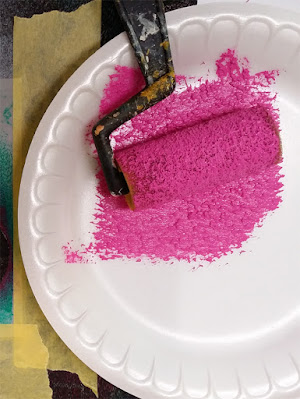
The sample-photo below shows a sponge brayer being loaded with paint ....


Below:  This sample-photo shows a paint-loaded brayer being rolled over my 6" x 6" Sassy Spray -- which has been secured with masking tape to a sheet of blue paper.


Moving ahead, I coated newsprint with an aqua and beige mixture; after that dried, I used a sponge brayer to add orange acrylic paint thru two borders from my Swatton Borders # 2  stencil L221.  (I had previously cut this 9" x 12" stencil into three strips.    It's not necessary to cut any of my three Borders series stencils into strips before use, but I find them easier to use this way.)  Altho the aqua-beige background is subtle, it remains in the blue/green color family, whereas the print has been made with a  complement color, orange.


Above:  I used translucent acrylic paint in the basecoat, allowing  some of the background print to remain visible, thus creating a layered look.  Enriching part of this background is an earlier print I'd made with 9" x 12" Two Vases L232 -- using blue acrylic paint.


Returning to an my earlier combination of strong complementary colors, I made two orange-background prints with bright aqua foregrounds. The print below was made with two of my Trivet series stencils -- left:  Trivet B s167 stencil; right: Trivet C s168.  Each of these stencils measures 6" x 6" and is part of a 4-piece series that includes one 9" x 12" stencil (Trivet 9 A L202.)


Above:  Trivet B s167, on the left, always reminds me of a turning wheel.  Trivet C s168, on the right, makes me think of razor blades!  I didn't design either of them with these images in mind.  It just happened on its own.


Above:  This print was made with one of the three borders included in the 9" x 12" Swatton Borders # 3 L222 stencil.


Today's next art sample stops using complementary colors, instead limiting itself to two colors nearly on the same side of the color wheel.  Complementary colors aren't the only way to create contrast that heightens interest.  Adding a bright white (a light value) to two dark values brings out an eye-catching contrast.....


Above:  Printed with Swatton Borders # 2 L221 (9" x 12")


Today's next-to-final art-sample:


Above: Once more, complementary colors are at play -- a blue-green background helps to emphasize the foreground print of orange.


Too late, I realized that I should have added more solid aqua to the background of this piece, before printing it with an orange paint-loaded sponge brayer and my 9" x 12" stencil Two Vases L232.  

But there's always a next time!

Here's a much better example--


Used:  9" x 12" stencil Two Vases L232 and 6" x 6" Tiger Lily s524. Notice the way dark green brings out the best of the yellow and orange background. 


Mentioned in today's post:


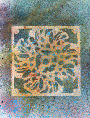
6" x 6" Tiger Lily s524


Swatton Borders # 3 L222 stencil (9" x 12")


Swatton Borders # 1 L220 (9" x 12")


Swatton Borders # 2 L221 (9" x 12")


Trivet A 9 L 202  (9" x 12")


Trivet A s166 (6" x 6")


Trivet C s168 (6" x 6")


Marbles 6 s080 (6" x 6")


Marbles 9 L156 (9" x 12")


Two Vases L232 (9" x 12")


To scroll thru the pages of my StencilGirl stencils and masks, please start here

I thank you kindly for visiting my blog today.  If you wish to subscribe, please leave a Comment below this post, giving your email address.  I will not publish the email or sell it.  It will be used only for subscription to this blog.